I went to see the “Pre-Raphaelites and Italy” Exhibition at the Ashmolean yesterday. I’m not a great fan of the Pre-Raphs, generally preferring Rothko to Ruskin, Miro to Millais, Bacon to Burne-Jones, Hockney and Hopper to Holman Hunt. But some good friends were keen so I went along with an open mind. Maybe my superficial knowledge of these artists could be replaced by an informed appreciation that they have more going for them than finely detailed paintings which make nice stationery and table mats.
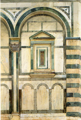
Ruskin – The Baptistry, Florence
The exhibition is as specific as the title implies, concentrating exclusively on this group of artists’ work inspired by their love of (some might say obsession with) classical Italian art and architecture. Ruskin’s influence is everywhere, both in his own drawings and paintings and those of his friends whom he despatched to Venice, Rome and Florence with instructions to copy pictures and draw buildings before they suffered further dilapidation. His own early pictures on display show stylised and static figures with expressionless faces. The detailed architectural drawings and watercolours he and they produced show impressive draughtsmanship but are too ‘photographic’ to excite as works of art.
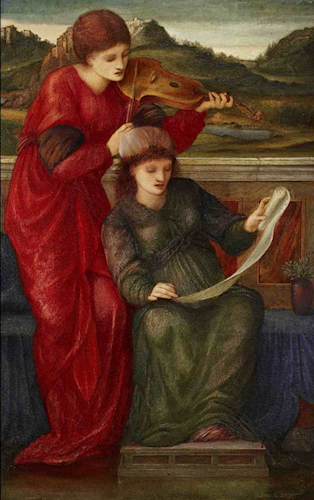
Burne-Jones – Music
The draughtsmanship carries through into to the more familiar paintings, including Rossetti’s near the end of the exhibition. I can admire the fine detail but still the figures are expressionless and the compositions static. I find nothing there to demand my attention and involve me in the picture, nothing to inspire or challenge or make me think.
I’m pleased to say though that I did find three paintings I liked and will remember, by two artists whose names I didn’t know before. Two panoramic landscapes by John Brett, one of Florence and one of Capri, impressed me with the way he captured evening light on the hills in the background (though the classical foreground of the Capri rather detracted from the effect). The third was a delightful landscape of the Venetian Lagoon by John Inchbold.
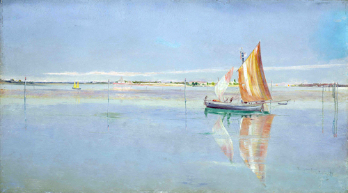
Inchbold – The Lagoon, Venice
So I know more about the Pre-Raphaelites than I did but I haven’t really changed my mind about them. I think they must have been dreadful luvvies. I wonder if their popularity owes as much to their not-so-private lives, romantic or sordid depending on your point of view, as to their painting.
Leaving the exhibition takes you into the shop where catalogues, academic and popular books and Pre-Raphaelite themed merchandise are on sale. I bought a fridge magnet.
The exhibition runs until 5 December